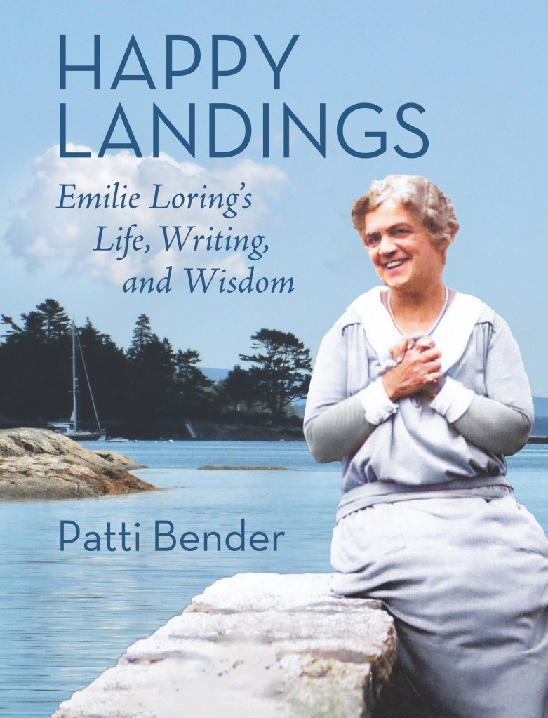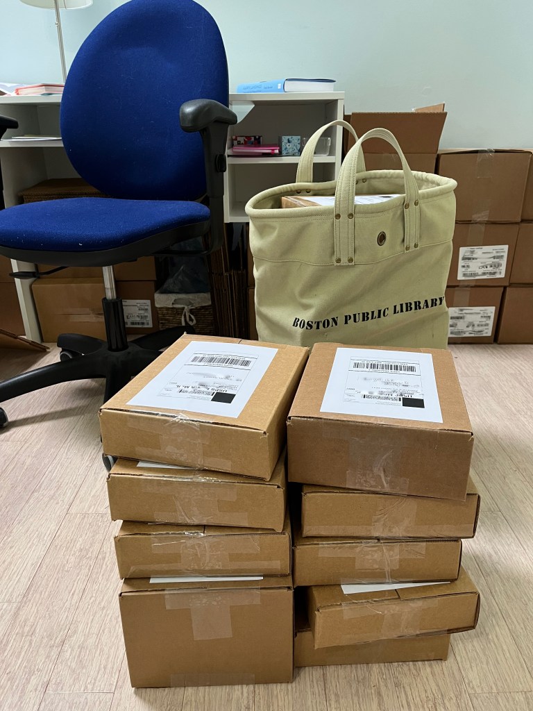
The first hundred autographed copies of Happy Landings have reached their destinations, and even before reading, it is making a good impression:
"The book is beautiful, photos are wonderful..."
"The books turned out so beautifully, and I immediately took a picture of them to send to my daughter..."
"It looks wonderful. I love the feel of the paper... so smooth."
Design for YOU
At the university, I taught human factors, which, simply put, involves optimizing design to suit the user. This isn’t something most people think about, so I hope you enjoy this peek into how design came into play with Emilie Loring’s biography.
An essential exercise in human factors design is the “walk through.” This is when you go through the steps that the user will take to see if they produce the experience you intend.
We do this naturally when we set up a special event. Do the decorations suit the occasion? Is the entrance welcoming? Is it clear where to find food, drink, a place to put your coat? Does the flow of spaces allow guests to circulate?
Museums plan user experiences carefully, with clear entrance markings, unmistakeable direction of travel, and helpful information provided at each display.

A book is a designed experience, too. The cover and title prepare you for the content and mood you’ll find inside, and each element contributes: color, image, and lettering style. Dark and moody or light and fresh? A dagger or a flower garden? A gash of red letters or a lilting script in gold? Before you open the cover, your senses have prepared you for what’s to come.
If you are undecided, turn the book over, and on the back cover, you’ll find the book’s sales pitch–appealing language, images, and testimonials to win your attention.
Romantic comedies, mystery men, courageous women, and the happy endings of today draw a direct line to the entertaining prose of Emilie Loring’s romance novels…
This is a woman’s story in swiftly changing times for women; a charming story with little-known anecdotes about prominent authors; and the story of a writer in the making, with advice and encouragement for aspiring authors.
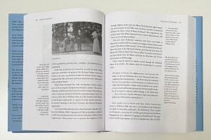
The interior of a book makes an impression, from the color and texture of the paper to the color, size, and style of the lettering.
Emilie Loring reached the height of her popularity in the 1930s, so we chose lettering styles for Happy Landings that evoke the period and preserved white space for an uncluttered look. You may not know to name it “Art Deco,” but the clean, open design has its effect, nevertheless.
After that, isn’t it just paragraph after paragraph until the book is done?
Sometimes.
But books can also be a little like museums, blending different kinds of content and guiding you from one to the next. Happy Landings is this type of book.
Positioning the Elements

Three elements are in play as you read: text, sidebar quotes, and images. The text is my voice, telling about Emilie’s life. When I quote someone else, their words are set apart in the usual fashion.
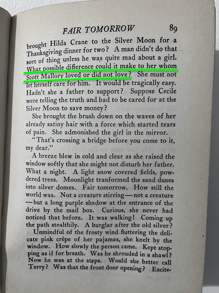
The sidebars are always Emilie’s voice, 351 quotes from her writings that comment on the same events or topics. It’s as though she were standing at my shoulder, chiming in with a personal addition. We worked very hard to get these passages side-by-side. Every so often, it was more effective if Emilie or I finished what we had to say before the other, so the placement was adjusted. (If you know any book designers, give them a hug when next you see them. They work very hard to satisfy desires like these.)
There are also the images and their captions–124 of them–mostly photographs but also a few maps and genealogical tables. My daughter recently complimented their placement, saying that she reads a passage about something and wishes she could see a picture of that, and on the very next page, she finds it.
A Printed Book
All of this is possible because the book is on paper, and paper has certain user qualities, which are called “affordances.” You can write on it, fold it, tear it, bind separate sheets together in an order that remains. Text and images can both be printed on paper, and they stay in place once we’ve put them there, so we can be quite exact in creating the book you will see.
In English, we read left to right, top to bottom, so elements at the top will generally be experienced before elements at the bottom, and we’ll go side-to-side before we go very far down on the page. Happy Landings is designed so that you can read my text and then Emilie’s comments, as a continuing conversation. If you know her books, you’ll have the most fun reading this way, because you will make connections between her life and familiar lines from her books.

You can always choose, though. If you want to read only my text and ignore Emilie’s comments, you can. If you want to read only Emilie’s sidebars and not the text, you can do that. In fact, if you read only Emilie’s quotes, her biography will still unfold, albeit more cryptically.

Finally, a printed book has size–height, width, depth, weight. Happy Landings weighs in at just over two pounds, 7.25″ x 9.5″ and 1.5″ deep. Without thinking, we associate small books with fast reading, large books with a longer time. Once we start reading, the relative depth of pages on the left and right of the book’s center let us know, without thinking, how far we’ve read and how much more we have to go. If we want to find something ahead or behind where we are, we can leaf through the pages and scan quickly.
An E-book
E-books weigh no more than the device on which you read them. You can easily carry Happy Landings and all thirty of Emilie Loring’s novels with you on vacation–and you never have to worry that someone will tear, fold, spill on, or write on your book.
People naturally have preferences for print or electronic books, but that’s not my focus here. I’d like to direct your attention to differences in the actual arrangement of words in the two formats.
When a book is all text, as a novel is, there is little difference between the printed book and its e-book counterpart, except the e-book is designed to expand or shrink to adapt to your reading device–laptop, tablet, or phone.
This adaptability of an e-book, though, is the very quality that limits its ability to handle multiple elements simultaneously. Imagine how little text could squeeze onto the screen, if there were a sidebar, too! The verticality of it would be impossible. Images can be difficult, too. We want to avoid chopping someone’s portrait in half, beginning on one page and continuing on the next!
(I just double-checked this post and reduced the size of images to fit on your phone. This is why I usually center the images in my posts, too–so they will fit!)
E-books succeed when elements are small and follow each other, which meant that the e-book for Happy Landings required a full re-design. No longer could my text be accompanied by Emilie’s in a sidebar.

Instead, I had to decide when her comments would interrupt the text, and the book designer used separators and lettering style to signal each change in voice.

The same words–all of them–are in both formats. The reading experience will be different, because in print, you have choices of where to direct your eyes, and the separate elements are more distinct. In the e-book, the choices have already been made for you–by me–so I hope you’ll find that it flows smoothly.
Happy Landings: Emilie Loring’s Life, Writing, and Wisdom was designed twice for you, once in each format.
When design is effective, only the designer thinks about it. The user simply enjoys it.
But it does make a difference.


Hi Patti!
Congratulations! I am impressed with the thoughtfulness of your book design. Very interesting. The blue is very appealing, a relaxing comforting happy shade of blue.
I am sure that I did not do your earlier pre-order system correctly. (Techno-idiot here,m I guess!) I filled out the pre-order form on the link you now have. I’ll get a check to you ASAP.
I cannot wait to receive my copy of your book Thank you for filling this need, interest, desire to know about the life of the woman whose 30 original (& 20 ghostwritten) books I have read over and over since I was a teen. Thank you! Thank you!
All the best on your book tour!
LikeLike
Thank you, Peggy. I’ll be glad when you get your copy. We who have spent so much time reading her books have a boundless capacity for learning more about her. 🙂 I hope to announce the “tour” before too long.
LikeLike
🙂
LikeLike
I got my book yesterday and it is lovely. I can’t wait to dive in
LikeLiked by 1 person
Happy reading!
LikeLike
Hi Patti,
I think I sent you payment for a book, but now I can’t find a record of it.
Lynota Siefferman
LikeLike
I received my copy and immediately like the “look” of it! Thank you for sharing how much thought you put into it. (You course sounds like it would have been interesting to take!). I’m saving it until I can savor it—hopefully soon. In the meantime, just looking at it puts me in a happy place. Thank you!
LikeLiked by 1 person
It’s a happy cover, isn’t it? When you get a little space for yourself, enjoy the read.
LikeLike
I received my copy! It is beautiful. I cannot wait to delve into it. It is larger than I expected but it looks soooo good. I love all the pictures you included.
LikeLiked by 1 person
Definitely a good value! I love the pictures, too. It’s rare to see so many of a person’s life in her time.
LikeLike