Imagine holding Happy Landings: The Life Behind Emilie Loring’s Stories in your hands for the first time. What is it like?
Are you holding a hard-cover book or a paperback? What’s on the cover?
It’s time to design the cover of Emilie Loring’s biography. I want it to have just the right appearance when it goes on sale to the public.
But I wrote the book; I already know what’s inside. I need a cover that entices people who have never seen the book to pick it up and want to read it. That’s where you come in.
Let’s imagine this book cover together. Imagine a design that will call to a reader from across a crowded bookstore or internet page: “A fascinating woman and author is inside this book. Come and meet her!”
Imagine a cover that will call to longtime Emilie Loring readers, “Here she is! It’s your chance to meet her in person and learn things you never even imagined about her and her books.”
Let’s look together at two of the biographies on my shelves.

Stan Musial’s name on this cover is identification enough for baseball fans, and to drive home the point, there’s a photo of him, swinging the bat. This is an all-American story about a hero of America’s past-time: Stan Musial: An American Life. The photo and lettering are red, white and blue, and Musial’s name is baseball-white on top of St. Louis Cardinals red.
The cover sends a clear message, and it also makes us wonder. He’s just hit the ball; how far did it go? What are his thoughts and memories as he looks into the distance?
The biographer’s name is smaller, out of the way, in the black and brown of the infield. George Vecsey is the author, but the story is Stan Musial’s.
Here’s another cover:

Which did you see first–“Laura Ingalls Wilder” (because we read top-to-bottom and left-to-right) or “Pioneer Girl” (because it is both larger and darker)? Both are prominent by design, and we see why that’s important in the descriptor: “The Annotated Autobiography.” Laura Ingalls Wilder wrote her autobiography, Pioneer Girl, which has now been annotated and edited by Pamela Smith Hill.


Few of us could identify Laura Ingalls Wilder in a photograph, but we remember the appearance of the Little House books. The cover of Prairie Girl is distinct, but its watercolor blues and greens and prairie grasses remind us of those childhood books. Young Laura holds paper and pen and looks off into the distance of memory, from which she wrote both her best-selling books and this autobiography.

Did you wonder why this book is nearly square? That is to allow for Pamela Smith Hill’s annotations to accompany Wilder’s autobiographical text. You can see that the autobiography, by itself, would fit into the more traditional, rectangular shape.
Would we want the cover of Happy Landings to evoke memories of Emilie Loring’s books?


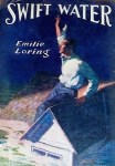
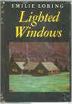


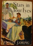

All have a color artwork, and most fill the cover. The titles are on the top third, and Emilie’s name varies in size and placement. There is no consistent font to recognize as “an Emilie Loring font,” and the images don’t necessarily illustrate the title or theme.
Emilie Loring was more than her writing career. Would we like a cover that was more thematic, historical, or personal?
I wanted to do a multiple-choice survey, but the server for that is down today, so let’s do it the old-fashioned way: Please jot your ideas below, in the Comments section, or on our Facebook page.

What would you choose for:
The clear message/theme of the cover:
The time period evoked
Cover image (artwork, photograph, collage, etc. Any that you love already?)
Overall color scheme (2-3 main colors)
Title and subtitle placement
Font style and color
I actually love design, and it’s been fun to scribble my ideas on scraps of paper. If you want to sketch something, even crazily on the back of an envelope, snap a quick photo of it, and send it to me at: contact@pattibender.com
Don’t do more than what you have fun with, but I’m sincere in wanting to hear from you. Happy Landings will be on our shelves a long time; let’s make it absolutely stunning!

When and where can I buy the book? Really looking forward to it!
LikeLiked by 1 person
Thanks, Judy. I can’t give you a date yet, but I’m as eager to get the book into your hands as you are to have it! I think we’ll all have to wait and see how things go…
LikeLike
I’d rather see the word “Novels” instead of ‘Stories’. Stories sounds like children books.
LikeLiked by 1 person
I understand that impression. Choices are stories, books, novels, writings… Writings may or may not be published, so don’t seem accomplished enough. Novels sounds less approachable than books to me, and includes only a portion of the full scope of her works, which included novels, short stories, serial novelettes, a play, articles, and book reviews. “Stories” seems more inclusive—although not perfect, either—and it fits with current interest in “storytelling.” That’s my thinking at the moment.
LikeLike
Sorry! I typed Patti with a “y”. My apologies.
LikeLiked by 1 person
No problem! My own mom has spelled it with a “y” before! 😊
LikeLike
I, too, love the parapet photo of her and hope you use that somewhere in the book, if not on the cover, as it really makes me feel like it is her personality shining through. I LOVE the original book cover looks and love the watercolor images with bright cheery colors as Peggy in IL said above it evokes her cheerful and forge-ahead-through-all-troubles book personalities. Other than those thoughts I have no help for you on the placement and design for the cover, but I have no doubt you will choose something that will resonate with all lovers of Emilie Loring. Rachael in MT
LikeLiked by 1 person
Thanks, Rachel. The parapet photo is gaining a following!
LikeLike
I like the layout of Stan Musial’s bio. Each element is strong. Laura’s bio tugs at the kid heart. Maybe I’m over that. I like big bold titles. Emilie’s picture is good.
LikeLiked by 1 person
Choosing a photo of Emilie is a trick. I love the parapet one, and she did, too. How do you create your covers? Do you hire them out or design them yourself?
LikeLike
I wasn’t sure whether I had some thoughts, but I guess I do.
1. I like that the Laura Ingalls bio is related to her books, but she wrote about her own life. An image of her fits in with her books well. It would be neat to see a proto-typical scene or hero/heroine from her novels on the cover, but the book is about her.She is frankly much older than the times and characters she wrote about. I vote for a photo of EL. It might be neat to have an (distant) image of the New England seashore/village, so prominent in her books, in the background. Yellow, blue, green coloring. Soft colors. I don’t like muted browns and grays. Too dull. They don’t fit her either. A person should sense the cheery nature of EL & her books. Maybe some background features to set the time and sense of adventure– such as a boat on the water, a plane in the air, and/or an auto on a nearby road, a locomotive engine with steam in the distance, all from early to mid 20 century? that sounds too cluttered but it doesn’t have to be.
-EL’s generation was born into horse and buggies and witnessed firsthand many amazing technological improvements. Autos, planes, phones, radio (wireless). Just wow! Can you imagine? Her writing did not reveal any discomfort with the world moving forward. Good for her!
2. If you have an image of EL that is standing upright, as in your photo here, then the text should be to the left. I like separating the title and subtitle. I am not sure I’m totally “in” with the trend of titles and subtitles of books. It makes citations so long! It’s been the fashion in nonfiction for a couple decades at least. You get a catchy title, plus people know clearly what you’re writing about in the subtitle. Black text is most readable with lighter water colors, I think.
All the best!
LikeLiked by 1 person
Lots of thought here, Peggy! I gave a talk in Blue Hill about Emilie Loring, and my first slide was much as you describe. I only have b&w photos of her, unless I colorize—that would be fun to try! Color words I think of in connection with her are sapphire, emerald, turquoise, azure, spruce, bronze, fluffy white, lemon yellow, ruby, topaz… A 30’s palette, I think, which is when she hit her stride as an author. (Definitely not dull brown/black! That illustration was meant to be a hazy place-holder for the real cover to come!) Not too pastel, not too dark; energetic and cheerful, dignified and approachable, classic and creative. Easy peasy! 😂 Yes, black text, and I’ve found a font that feels just right!
LikeLike
Hi Patty,
You could superimpose a bw photo over a light watercolor background. I do like the photo of her on the parapet as well. The village/seashore (whatever) could be behind her….
Sounds neat to be able to imagine how the cover should look. It’s as intricate as building a house–choosing fonts on the book, or handles on kitchen cabinets. Good luck and have fun imagining. You’ll know it when you see it.
Peggy
LikeLiked by 1 person
It’s lots of fun! From that parapet, she had a view of Blue Hill Bay. It’s overgrown with trees now, but it was a full view then. How pretty it must have been!
LikeLike